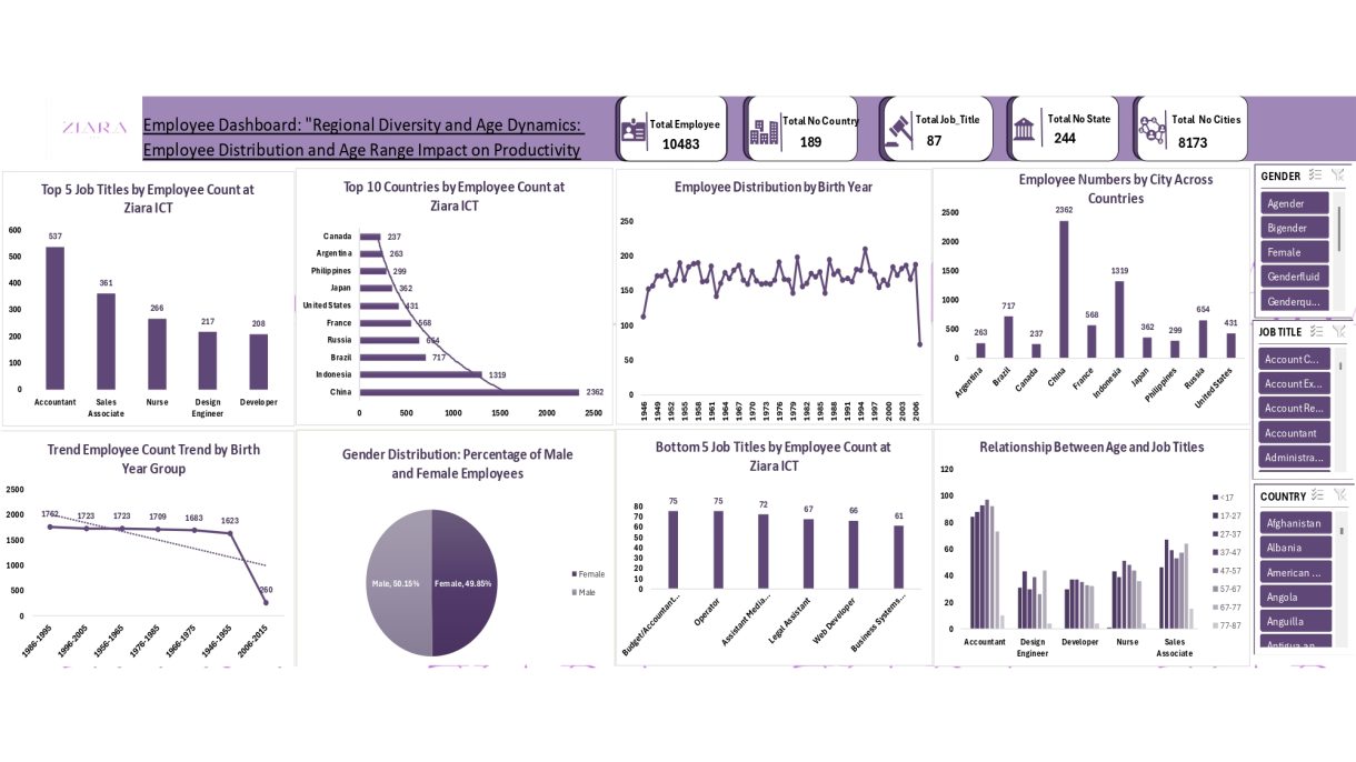
EMPLOYEE DASHBOARD: “Regional Diversity and Age Dynamics: Employee Distribution and Age Range Impact on Productivity.
I had leveraged on Microsoft Excel for data cleaning, data visualization and analysis. Using a dataset containing employee information such as employee ID, job titles, birth dates, cities, state, countries and gender, I created insightful dashboards to explore workforce distribution and trends. The project involved transforming raw data into meaningful insights through various charts and pivot tables, allowing for an interactive and comprehensive view of the organization’s employee demographics and patterns. This analysis helps inform strategic decisions in HR and business operations.
Overview
I recently ventured into a project focused on employee data analysis, where I utilized Excel to transform raw data into actionable insights through data visualization and pivot tables. After cleaning the dataset, which included fields like Employee ID, Job Titles, Birth Dates, Cities, State, Countries and Gender, I created a series of visual representations and conducted in-depth analysis using Excel’s advanced features.
Features
- Data Visualization: I developed various charts, including column, pie, and line charts, to display key employee metrics. Each chart was customized for enhanced readability and presentation.
- Pivot Tables: Excel’s Pivot Table feature was employed to summarize employee data across fields such as job title, gender, and country. Slicers and timelines added interactivity, allowing for dynamic data exploration.
- Advanced Excel Techniques: From calculating employee age using formulas to grouping data in pivot tables, I utilized advanced Excel tools to uncover meaningful insights.
Dashboard Design
The dashboard was designed to be interactive, intuitive, and visually compelling. It includes:
- Charts:
- A bar chart showing employee counts by job title.
- A pie chart illustrating the gender distribution.
- A line chart depicting employee numbers over the years.
- Pivot Tables:
- Summarizing employee data by country, state, and job title.
- Allowing users to filter data by job title, birth year, and gender using slicers and timelines.
This layout ensures that stakeholders can easily navigate and analyze critical metrics.
Observations
- Key Insights:
- Most employees are concentrated in a few key job titles, helping guide HR recruitment and development strategies.
- The employee age demographic shows a clear trend, which can aid in planning for succession and benefits.
- Gender distribution is balanced, but more granular analysis by location or job title could assist in diversity initiatives.
Design Thinking
I approached this project with design thinking principles:
- Empathy: I considered the end users’ need for clear, actionable data insights.
- Define: The challenge was to present the cleaned data in a way that addressed key business questions.
- Ideate: I experimented with various chart types and pivot table setups to determine the best methods of communication.
- Prototype: After creating the charts and tables, I refined the design by adding labels, titles, and formatting for clarity.
- Test: By interacting with the slicers and timelines, I tested the dashboard’s functionality and optimized it for ease of use.
This process resulted in a dynamic, user-friendly dashboard that provides meaningful insights for data-driven decision-making.
